
The code for the Safety Center UI is located in the safetycenter directory
packages/modules/Permission/PermissionController/src/com/android/permissioncontroller/safetycenter/.
Customize the Safety Center UI using the Runtime Resource Overlays (RROs) in the
OEM overlay folder. For information on RROs, see Change the value of an app's
resources at runtime.
Safety Center themes and colors
Safety Center has four principle themes that share the same UI attributes:
- Safety Center light
- Safety Center dark
- Safety Center Quick Settings light
- Safety Center Quick Settings dark
Safety Center themes contain default colors. The principle UI colors are drawn from Android system colors and can adapt automatically with OEM's general customization of Android color. By default, these colors adapt as part of Material You styling in Android.
You can change Safety Center colors by overriding their values.
| Safety Center UI color | Attribute name | Resource |
|---|---|---|
| Background | android:colorBackground |
@android:color/background_device_default_light@android:color/primary_dark_device_default_settings |
| Surface | colorSurface |
@color/sc_surface_light
@color/sc_surface_dark |
| Surface variant | colorSurfaceVariant |
@color/sc_surface_variant_light@color/sc_surface_variant_dark |
| Primary text | android:textColorPrimary |
@android:color/text_color_primary |
| Secondary text | android:textColorSecondary |
@android:color/text_color_secondary |
| Icons | android:textColorSecondary |
@android:color/text_color_secondary |
| Resource | Default value |
|---|---|
@color/sc_surface_light |
@android:color/system_neutral1_500 with an L star value
of 98 (perceptual luminance) |
@color/sc_surface_dark |
@android:color/system_neutral1_800 |
@color/sc_surface_variant_light |
@android:color/system_neutral2_100
|
@color/sc_surface_variant_dark
|
@android:color/system_neutral1_700
|
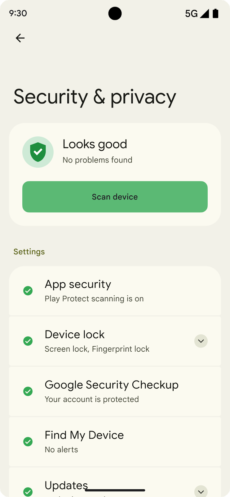
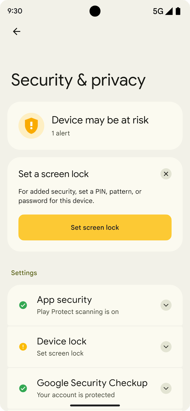
Issue severity colors
Safety Center communicates issue severity with a traffic light color system:
- Green for informational issues and OK status
- Yellow for recommendations
- Red for serious issues
- Gray for an absence of information
By default, these colors are drawn from the Google Material color palette. We recommend that you keep these base colors, but you can use different shades of the green, yellow, and red palette.
These color attributes are used for associating severity-colored items in the
Safety Center UI including icons, buttons, and scanning and status change
animations. Modifying these colors recolors all elements. For example, modifying
@color/sc_status_info_{light,dark} changes the background color in both the
static status image and the animation of the background during a scan.
The Safety Center Quick Settings theme uses dark mode colors, whether or not the device is set in dark mode.
| Severity | UI Element | Attribute or resource name | Default color |
|---|---|---|---|
| Info (Green) | Status shield | ?attr/colorScStatusInfo |
Light: Green 600 (#1e8e3e) Dark: Green 500 (#34a853) |
| Status shield container | ?attr/colorScStatusBackgroundInfo |
Light: Green 100 (#ceead6)colorSurfaceVariant |
|
| Icon | ?attr/colorScIconInfo |
Green 500 (#34a853) | |
| Primary action button | @color/safety_center_button_info |
Green 400 (#5bb974) | |
| Secondary action button | @color/safety_center_outline_button_info |
Green 300 (#81c995) | |
| Recommendation (Yellow) | Status shield | ?attr/colorScStatusRecommend |
Light: Yellow 600 (#f9ab00) Dark: Yellow 500 (#fbbc04) |
| Status shield container | ?attr/colorScStatusBackgroundRecommend |
Light: Yellow 100 (#feefc3) Dark: colorSurfaceVariant |
|
| Icon | ?attr/colorScIconRecommend |
Yellow 500 (#fbbc04) | |
| Primary action button | @color/safety_center_button_recommend |
Yellow 400 (#fcc934) | |
| Secondary action button | @color/safety_center_outline_button_recommend |
Yellow 300 (#fdd663) | |
| Warning (Red) | Status shield | ?attr/colorScStatusWarn |
Light: Red 600 (#d93025) Dark: Red 500 (#ea4335) |
| Status shield container | ?attr/colorScStatusBackgroundWarn |
Light: Red 100 (#fad2cf) Dark: colorSurfaceVariant |
|
| Icon | ?attr/colorScIconWarn |
Red 500 (#ea4335) | |
| Primary action button | @color/safety_center_button_warn |
Red 400 (#ee675c) | |
| Secondary action button | @color/safety_center_outline_button_warn |
Red 300 (#f28b82) | |
| No recommendation (Gray) | Icon | ?attr/colorScIconNull |
Gray 600 (#80868b) |
In Android 14, overlayable color resources have been added for each theme color property, and some default colors have been modified:
| Resource name | Android 13 backing color | Android 14 backing color | Android 14 hex code |
|---|---|---|---|
@color/sc_status_info_light |
Green 600 | Semantic Green | #0E8435 |
@color/sc_status_recommend_light |
Yellow 600 | Unchanged | |
@color/sc_status_warn_light |
Red 600 | Unchanged | |
@color/sc_status_info_dark |
Green 500 | Green 400 | #5BB974 |
@color/sc_status_recommend_dark |
Yellow 500 | Yellow 400 | #FCC934 |
@color/sc_status_warn_dark |
Red 500 | Red 400 | #EE675C |
@color/sc_status_background_info_light |
Green 100 | Unchanged | |
@color/sc_status_background_recommend_light |
Yellow 100 | Unchanged | |
@color/sc_status_background_warn_light |
Red 100 | Unchanged | |
@color/sc_status_background_info_dark |
sc_surface_variant_dark | Unchanged | |
@color/sc_status_background_recommend_dark |
sc_surface_variant_dark | Unchanged | |
@color/sc_status_background_warn_dark |
sc_surface_variant_dark | Unchanged | |
@color/sc_icon_info_light |
Green 500 | Unchanged | |
@color/sc_icon_recommend_light |
Yellow 500 | Unchanged | |
@color/sc_icon_warn_light |
Red 500 | Unchanged | |
@color/sc_icon_null_light |
Grey 600 | Unchanged | |
@color/sc_icon_info_dark |
Green 500 | Green 400 | |
@color/sc_icon_recommend_dark |
Yellow 500 | Yellow 400 | |
@color/sc_icon_warn_dark |
Red 500 | Red 400 | |
@color/sc_icon_null_dark |
Grey 600 | Grey 400 | #BDC1C6 |
@color/sc_shield_accent_dark |
Not available | Grey 900 | #202124 |
UI colors
Green state
| Green Shield | |
|---|---|
|
#1E8E3E (green/600) |
| Dark theme #34A853 (green/500) |
|

| Green container | |
|---|---|
|
#CEEAD6 (green/100) |
| Dark theme #474741 |
|

| Green settings icon | |
|---|---|
|
#34A853 (green/500) |
| Dark theme #34A853 (green/500) |
|

| Scan button | |
|---|---|
|
Green button |
| #5BB974 (green/400) | |

| Title | Subtitle |
|
|
|---|---|
| #1B1C17 (TextColorPrimary) | #46483B (TextColorSecondary) |
Yellow state
| Yellow Shield | |
|---|---|
|
#F9AB00 (Yellow/600) |
| Dark theme #FBBC04 (yellow/500) |
|

| Yellow container | |
|---|---|
|
#FEEFC3 (yellow/100) |
| Dark theme #474741 (yellow/500) |
|

| Yellow settings icon | |
|---|---|
|
#FBBC04 (yellow/500) |
| Dark theme #FBBC04 (yellow/500) |
|
| Scan button | |
|---|---|
|
Yellow button |
| #5BB974 (Yellow/400) | |

| Title | Subtitle |
|
|
|---|---|
| #1B1C17 (TextColorPrimary) | #46483B (TextColorSecondary) |
Red state
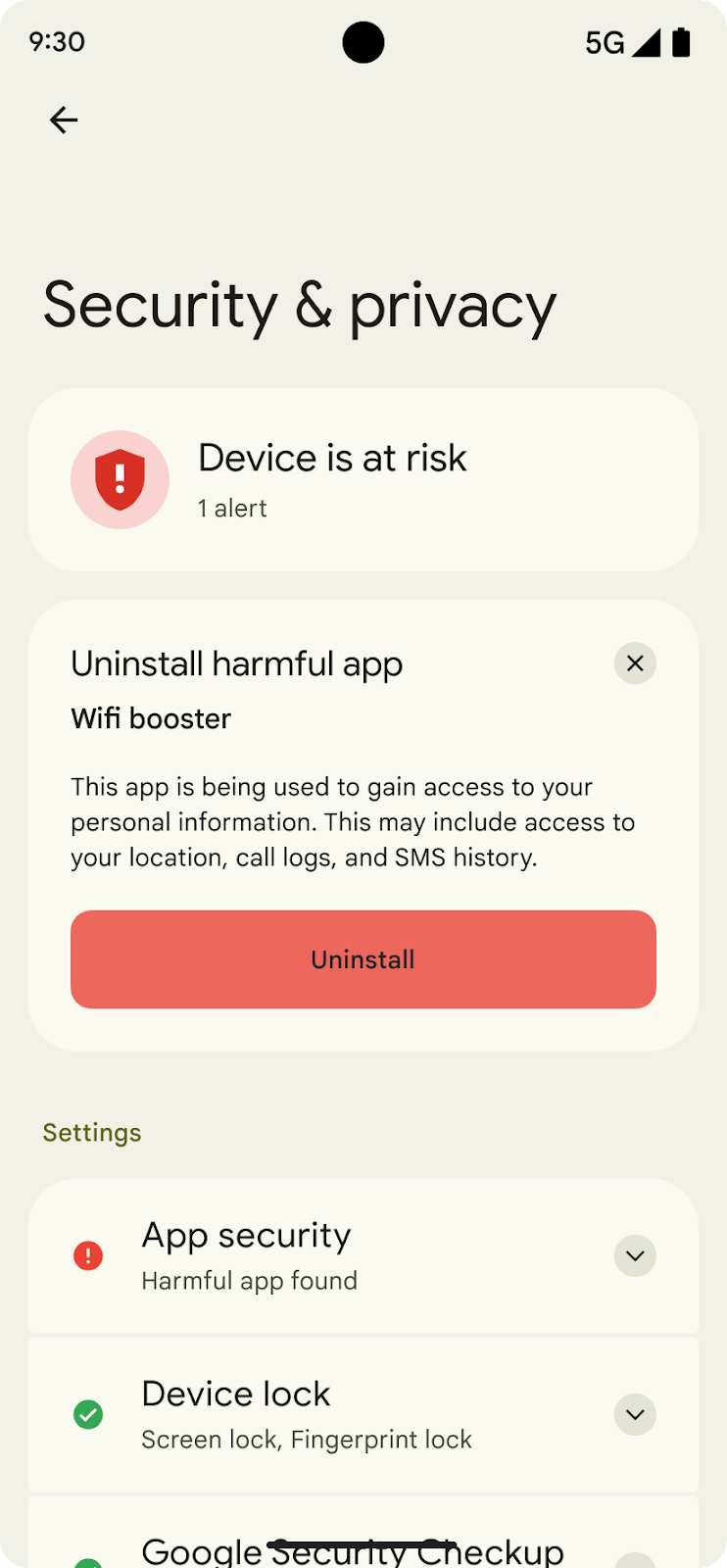
| Red Shield | |
|---|---|
|
#D93025 (Red/600) |
| Dark theme #EA4335 (red/500) |
|

| Red container | |
|---|---|
|
#FAD2CF (red/100) |
| Dark theme #474741 |
|

| Red settings icon | |
|---|---|
|
#EA4335 (red/500) |
| Dark theme #EA4335 (red/500) |
|
| Uninstall button | |
|---|---|
|
Red button |
| #EE675C (red/400) | |

| Title | Subtitle |
|
|
|---|---|
| #1B1C17 (TextColorPrimary) | #46483B (TextColorSecondary) |
Fonts and text appearance
Safety Center fonts and text appearance are based on the Android default text appearance and should inherit any changes to a font family, weight, and other properties already configured by OEMs to their device-wide styles. Safety Center text appearance can be overridden directly using RROs.
| Safety Center Text appearance | DeviceDefault base | Color | Size | Weight |
|---|---|---|---|---|
TextAppearance.SafetyCenter.Headline |
TextAppearance.DeviceDefault.Headline |
android:textColorPrimary |
Varies | Regular |
TextAppearance.SafetyCenter.Headline.Status |
TextAppearance.DeviceDefault.Headline |
android:textColorPrimary |
22 sp/28 sp | " |
TextAppearance.SafetyCenter.Headline.Issue |
TextAppearance.DeviceDefault.Headline |
android:textColorPrimary |
18 sp/24 sp | " |
TextAppearance.SafetyCenter.Headline.Entry |
TextAppearance.DeviceDefault.Headline |
android:textColorPrimary |
20 sp/24 sp | " |
TextAppearance.SafetyCenter.Medium |
TextAppearance.DeviceDefault.Medium |
Varies | 14 sp/20 sp or 16 sp/24 sp |
Medium |
TextAppearance.SafetyCenter.Body |
TextAppearance.DeviceDefault.Small |
android:textColorSecondary |
14 sp/20 sp | Regular |
Spacing and styles
Safety Center uses a set of default padding values universally for padding and margins. Change the Safety Center information density by overriding the spacing values.
| Resource name | Default value |
|---|---|
@dimen/sc_spacing_xxxsmall |
2 dp |
@dimen/sc_spacing_xxsmall |
4 dp |
@dimen/sc_spacing_xsmall |
8 dp |
@dimen/sc_spacing_small |
12 dp |
@dimen/sc_spacing_medium |
14 dp |
@dimen/sc_spacing_large |
16 dp |
@dimen/sc_spacing_xlarge |
18 dp |
@dimen/sc_spacing_xxlarge |
20 dp |
@dimen/sc_spacing_xxxlarge |
24 dp |
You can customize corner radiuses of the Safety Center cards. One corner size radius is used for buttons and three corner sizes are used for Safety Center cards:
| Resource name | Default value |
|---|---|
@dimen/sc_button_corner_radius |
12 dp |
@dimen/sc_card_corner_radius_large |
28 dp |
@dimen/sc_card_corner_radius_medium |
20 dp |
@dimen/sc_card_corner_radius_xsmall |
4 dp |
Quick Settings tile
Safety Center is accessible from a Quick Settings tile implemented in the PermissionController module. The Quick Settings tile reuses some of the UI components from the Safety Center screens so overlayables could work:
- Quick Settings tile service:
SafetyCenterQsTileService.kt - Quick Settings activity:
SafetyCenterQsActivity.java